Introducing The Custom Elements Dev Server

If you're building web components, you've probably used Storybook. It's great! But it's also framework-focused, requires writing stories in JavaScript/MDX, and adds a lot of overhead when all you really want is to see your HTML custom elements in a browser.
That's why I built cem serve: an opinionated development server designed specifically for web components and HTML.
What is cem serve?
Think Storybook for HTML. It's a custom-elements manifest-driven development server for your web components. You write short HTML partials which show off your components, and cem serve wraps them up into a live-reloading dev server with auto-generated knobs.
The server's UI and workflow are based on your Custom Elements Manifest. It uses the same code as in the cem generate command to discover HTML demos according to your configuration, then it generates demo pages complete with interactive knobs, based on your manifest metadata. When you edit demo files or their dependencies, the server reloads the page for you.
One of the nicest features is the buildless development workflow: cem serve automatically transforms TypeScript to JavaScript, and CSS module scripts (e.g. import styles from './my-button.css' with { type: 'css' }), on-the-fly.
Usage
Write JSDoc, or HTML and CSS comments to document your components. If you're using Lit and TypeScript, cem generate will pick up on your @property decorators and add them to the manifest as attributes. It also automatically detects slots in your render() method, so you don't need to declare them in JSDoc.
Tell cem about your demo files by adding the generate.demoDiscovery setting, or by using the @demo JSDoc tag.
import { LitElement, html, css } from 'lit';
import { customElement, property } from 'lit/decorators.js';

import styles from './my-button.css' with { type: 'css' };

/**
 * A button for performing actions
 * @demo demo/my-button.html
 */
@customElement('my-button')
export class MyButton extends LitElement {
  static styles = [styles];

  /** Button variant (primary, secondary, danger) */
  @property() variant = 'primary';

  /** Button text */
  @property() label = '';

  /** Disabled state */
  @property({ type: Boolean, reflect: true }) disabled = false;

  render() {
    return html`
      <button ?disabled=${this.disabled}>
        <!-- Text label, or additional content, like icons -->
        <slot>${this.label}</slot>
      </button>
    `;
  }
}
Optionally, run the cem generate command to create your custom-elements.json file, with all your component metadata - attributes, properties, events, slots, everything.
cem generateDon't worry about skipping this step, cem serve will create one for you in-memory when you launch the server.
Writing HTML Demos
Demo files are HTML partials which users of your elements can copy and paste on to a page. cem serve will wrap them up in a helpful UI, so don't worry about <html>, <head>, or <body> elements.
Here's an example demo:
<my-button variant="primary"
           label="Click me"></my-button>

<script type="module">
  import '@my-elements/my-button.js';
</script>
The demo includes everything a user would need to drop the element on a page (assuming an import map is set up) You can also include inline style tags or link to stylesheets if you need to. The idea is to demonstrate a complete unit, in terms of simple HTML, CSS, and if necessary, JavaScript.
Running the Dev Server
npx @pwrs/cem serveOpen http://localhost:8000 and you'll see a listing of all the demos in your project.
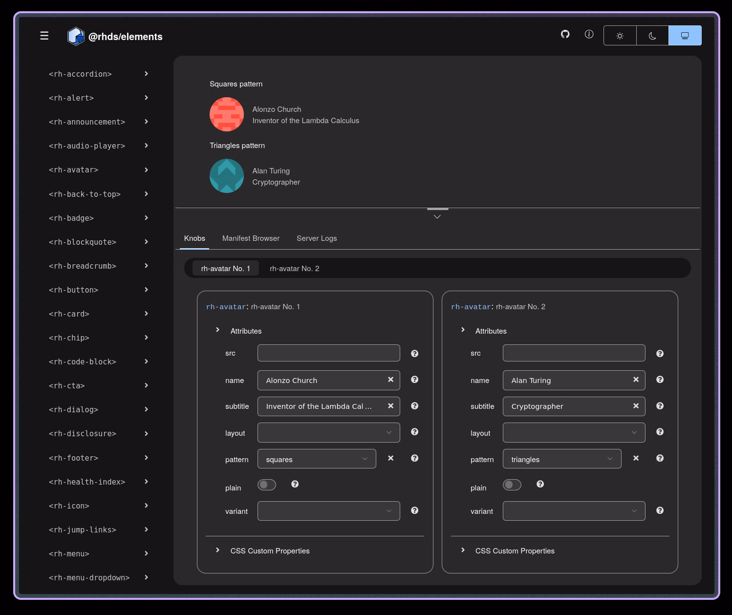
Auto-Generated Knobs
With cem serve, knobs are auto-generated from your manifest. Document your component once, get knobs for free, without defining them explicitly in code.
Knobs are based on the entries in your manifest, so if your attributes and class fields are well-typed (via JSDoc or TypeScript typings), then the generated knobs will match: text input for strings, number input for numbers, select fields for enums.
Why it Matters
The cem project in general pursues a standards-based development model, where the least amount of magic and framework cruft is applied to the development loop.
The addition of the dev server closes the gap, now cem is a complete development toolkit for web components, combining manifest generation, dev server, lsp for editor support, and mcp for AI support.
Demos are Just HTML
With cem serve's workflow, your demos aren't framework-specific stories, or a custom markdown flavour; they're pure HTML. That means your users can copy them directly from your docs. They also work in any environment (React, Vue, vanilla JS, whatever). Your demos don't require any special knowledge to read and understand, anyone who knows HTML, JS, and the DOM can read your demos. There's no framework version lock-in, and LLM coding tools can easily convert them from basic DOM to framework integrations, if needed, especially by leveraging cem mcp.
How Does This Compare?
Let's look at cem serve alongside other popular development tools:
| Feature | cem serve | Storybook | Vite | @web/dev-server |
|---|---|---|---|---|
| Purpose | Web component preview | Component stories | General dev server | General dev server |
| Demo Format | Plain HTML | JSX/MDX stories | HTML/Framework | HTML |
| Component Isolation | ✅ Built-in | ✅ Built-in | ❌ None | ❌ None |
| Interactive Knobs | ✅ Auto-generated | ✅ Manual setup | ❌ None | ❌ None |
| Demo Discovery | ✅ Manifest-driven | ✅ Story files | ❌ Manual | ❌ Manual |
| TypeScript | ✅ On-the-fly | ⚠️ Requires build | ✅ On-the-fly | ⚠️ Plugin needed |
| Reload Strategy | Full page | HMR/Full page | HMR | Full page |
| Configuration | Low (manifest) | Medium | Low | Low |
When to Use Each
Use @web/dev-server or Vite if you need a generic, fully customizable dev server. Use Storybook if you're locked in to legacy frameworks, are hooked on their extensive addon ecosystem, or just have thing for MDX.
Use cem serve when you're building web components in isolation and want a hassle-free, streamlined development workflow.
The sweet spot for cem serve is component libraries that need to work across frameworks. Your demos are HTML, so they're portable. Your knobs come from the manifest you're already generating. Zero configuration.
Try It
npm install --save-dev @pwrs/cem
npx @pwrs/cem serve
go install bennypowers.dev/cem
cem serveWorks best with LitElement or vanilla custom elements. If you've already got a Custom Elements Manifest, you're golden.
Links
Built with Go, TypeScript, PatternFly Design System, and Web Components. Licensed GPL-3.0-or-later.
Have questions or feedback? open an issue.