PatternFly Elements
A Performant Design System
- Benny Powers
- Principal UX Engineer
What are Web Components
UI toolkits and frameworks stretching back to Delphi 1 (1995) have modelled UIs around components - reusable, encapsulated objects with consistent external APIs

(large scale - compare to native ui frameworks)
Web Component Core Technologies


<template>

Good for leaf nodes and for page views Good for design systems and one-offs Good for heavy client side apps and lightweight server-rendered pages
- Low Overhead, ship less js, leverage optimized browser APIs
- marketing sites, microfrontends, framework SPAs, and MPAs can share code and design patterns
- limit framework churn with simplified tooling
- train web developers, not framework developers
Large Organizations and small Projects
Open the inspector - This presentation is made with web components custom elements
Design Systems at Red Hat
A Brief History
- 2012: Design Free for All
-
- Multiple web properties
- Each their own design processes
- Disparate look and feel
- 2014: PatternFly 1
-
- Proof of concept using Bootstrap
- First steps to align design language
- 2017: RH Elements Web Components
- Red Hat's first attempt at a component-based design system
- Bring these in from DX Source Deck
- Why did we need a design system?
- Why does it need to be open source?
- Why does it need to be web components?
- How have our customers benefitted?
A Brief History
- 2018: PatternFly React
-
- Elaborated on the Bootstrap MVP
- An application design system
- But only for React applications
- 2020: PatternFly Elements
-
- Cross-platform interoperable web components.
- Parallel effort, with divergent goals and UI needs
- 2022: PatternFly Elements v2
-
- 1:1 design alignment with PFv4
- Built for web apps
- Interoperable core and tools
PF 1 targetted app developers only
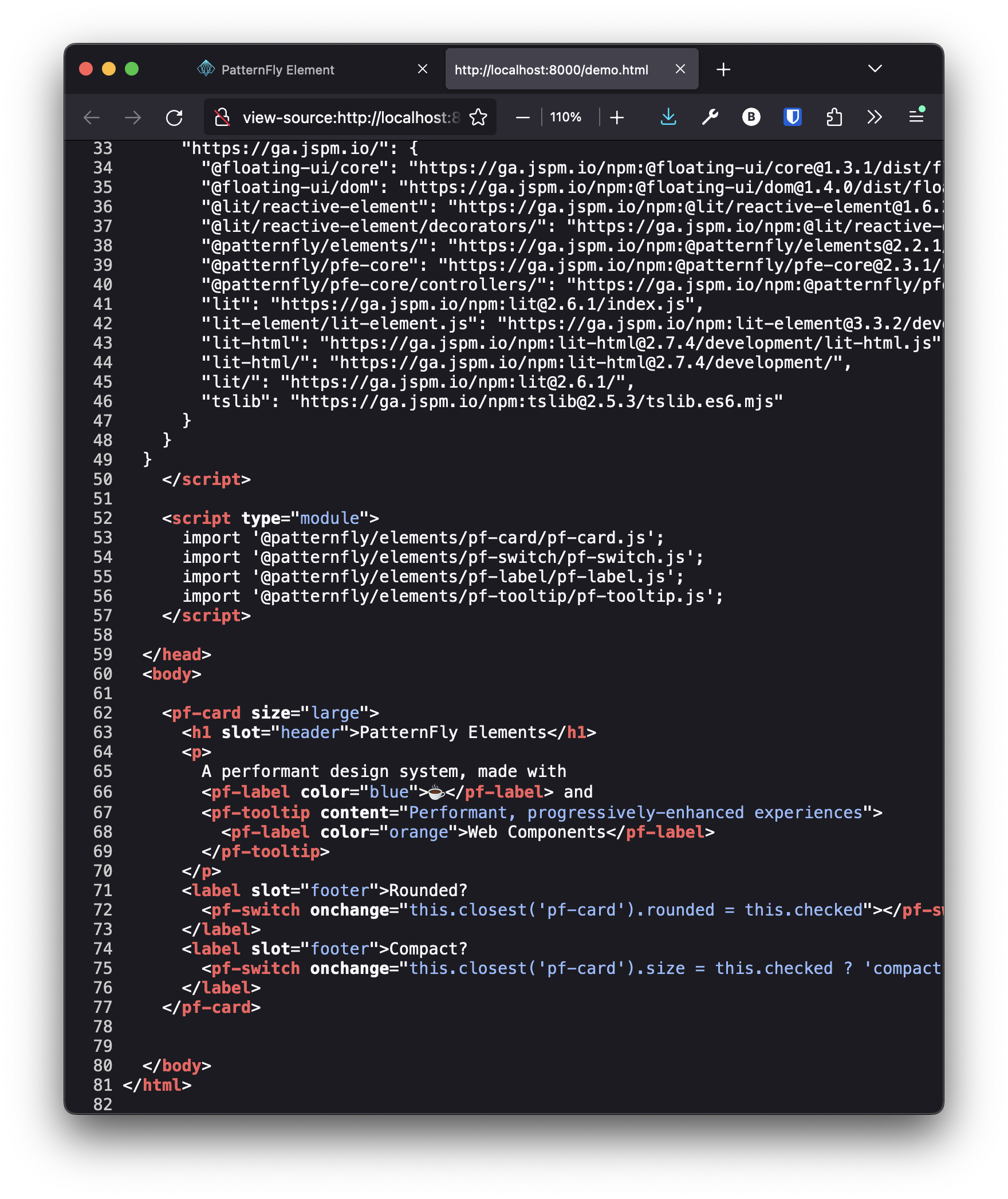
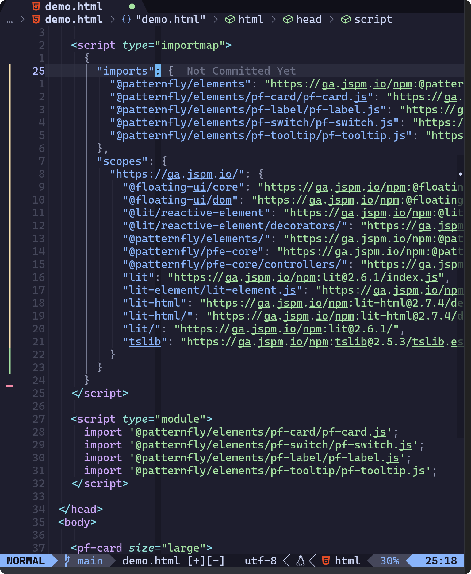
<pf-card>
<pf-card rounded>
  <h3 slot="header">PatternFly Card</h3>
  <p>
    Provides header, body, and Footer Slots.
    Attributes like <code>rounded</code> and
    <code>size</code> make variant styling easy.
  </p>
  <pf-button slot="footer">OK</pf-button>
  <pf-button danger slot="footer">Cancel</pf-button>
</pf-card>PatternFly Card
Provides header, body, and Footer Slots.
Attributes like rounded and
size make variant styling easy.
A card is a square or rectangular container that can contain any kind of content. Cards symbolize units of information, and each one acts as an entry point for users to access more details. For example, in dashboards and catalog views, cards function as a preview of a detailed page. Cards may also be used in data displays like card views, or for positioning content on a page.
<pf-accordion>
<pf-accordion>
  <pf-accordion-header expanded>
    <h3>Freedom 0: To Run</h3>
  </pf-accordion-header>
  <pf-accordion-panel>
    <p>The freedom to run the program
       as you wish, for any purpose.</p>
  </pf-accordion-panel>

  ...
</pf-accordion>Freedom 0: To Run
The freedom to run the program as you wish, for any purpose.
Freedom 1: To Study
The freedom to study how the program works, and change it so it does your computing as you wish. Access to the source code is a precondition for this.
Freedom 2: To Redistribute
The freedom to redistribute copies so you can help others
Freedom 3: To Change
The freedom to distribute copies of your modified versions to others. By doing this you can give the whole community a chance to benefit from your changes. Access to the source code is a precondition for this.
An accordion is an interactive container that expands and collapses to hide or reveal nested content. It takes advantage of progressive disclosure to help reduce page scrolling, by allowing users to choose whether they want to show or hide more detailed information as needed.
<pf-modal>
<pf-button id="usage-trigger">Open modal</pf-button>
<pf-modal variant="small" trigger="usage-trigger">
  <h2 slot="header">Modal with a header</h2>
  <p>Lorem ipsum dolor sit amet,
    <a href="#foo">consectetur adipisicing</a> elit,
    sed do eiusmod tempor incididunt ut labore et dolore magna aliqua.
    Ut enim ad minim veniam, quis nostrud exercitation ullamco laboris.
    Duis aute irure dolor in reprehenderit in voluptate velit esse.
    Excepteur sint occaecat cupidatat non proident,
    sunt in culpa qui officia deserunt mollit anim id est laborum.</p>
  <a slot="footer" href="#bar">Learn more</a>
</pf-modal>Modal with a header
Lorem ipsum dolor sit amet, consectetur adipisicing elit, sed do eiusmod tempor incididunt ut labore et dolore magna aliqua. Ut enim ad minim veniam, quis nostrud exercitation ullamco laboris. Duis aute irure dolor in reprehenderit in voluptate velit esse. Excepteur sint occaecat cupidatat non proident, sunt in culpa qui officia deserunt mollit anim id est laborum.
Learn moreA modal displays important information to a user without requiring them to navigate to a new page.
Lit, TypeScript, CSS, PatternFly design tokens
Although PatternFly elements are written using Lit, They work in any or no framework
You don't have to use Lit to use PatternFly elements
- PatternFly React
- PatternFly Elements
- PatternFly React
- PatternFly Elements
- PatternFly React
- PatternFly Elements
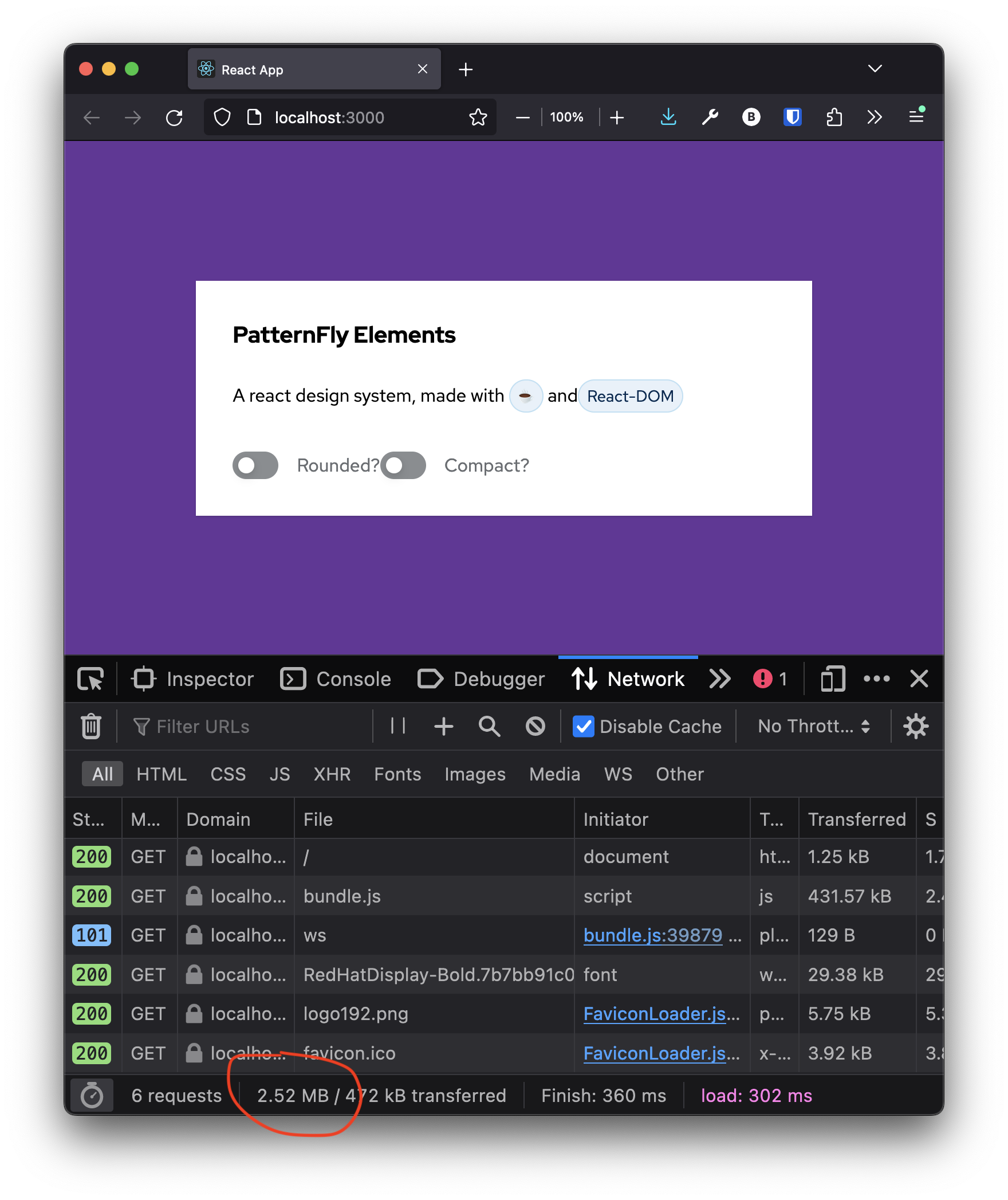
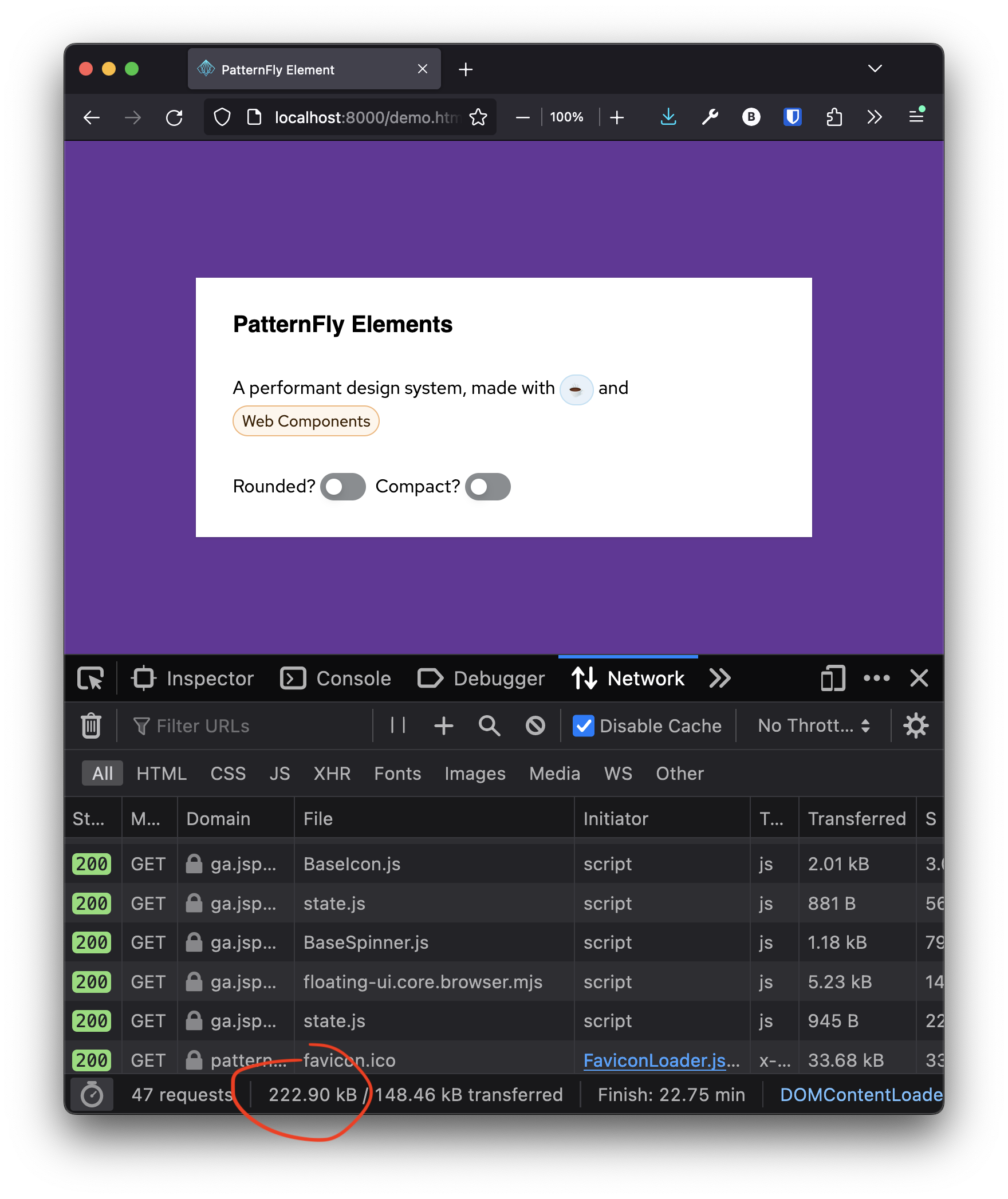
30168 LoC package lock
-
pf-progress-indicator
-
pf-tooltip
-
rh-cta
-
rh-footer
-
at scale
-
independent teams