Knobs
cem generate with proper type annotations to get better controls.
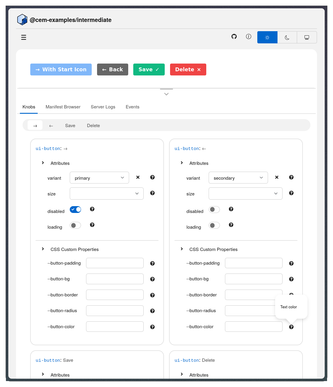
The dev server generates interactive controls (knobs) that let you test custom elements by manipulating their attributes, properties, and CSS custom properties in real-time. Knobs are automatically generated from your Custom Elements Manifest , so the type information and documentation you write with JSDoc directly determines which controls appear in the sidebar. This complements the development workflow by providing immediate visual feedback during the test phase , letting you verify component behavior across different states without writing test HTML for each variation.
Knobs derive entirely from your manifest—when you
run cem generate
, your JSDoc type annotations determine the control type. Boolean attributes become checkboxes, union types become select dropdowns, numbers get increment/decrement controls, and CSS color properties get color pickers. The dev server scans your
demo HTML
for custom elements, looks up each element’s manifest entry, and creates labeled control groups in the sidebar.
The Workflow
Everything derives from your component documentation - the manifest is the single source of truth.
How Knobs Map to Controls
The dev server reads your manifest’s attributes array (DOM attributes like disabled), members array (JavaScript properties like data), and cssProperties array (CSS variables like --bg-color). Each entry’s type information determines which control appears—boolean types become checkboxes, union types become select dropdowns, numbers get increment/decrement controls, and CSS color values get color pickers with hex input.
| Type | Control | Example |
|---|---|---|
boolean | Checkbox | @attr {boolean} disabled |
string | Text input | @attr {string} label |
number | Number input | @property {number} count |
'a' | 'b' | 'c' | Select dropdown | @attr {'primary' | 'secondary'} variant |
| CSS color | Color picker | @cssprop --bg-color |
TypeScript and Lit Support
If you’re using
Lit
with TypeScript, cem generate automatically infers type information from decorators and TypeScript annotations—no JSDoc required. The @property() decorator with TypeScript types provides everything needed for knobs generation:
import { LitElement, html } from 'lit';
import { customElement, property } from 'lit/decorators.js';

@customElement('my-element')
export class MyElement extends LitElement {
  // Boolean type → checkbox knob
  @property({ type: Boolean }) disabled = false;

  // String type → text input knob
  @property() name = 'World';

  // Number type → number input knob
  @property({ type: Number }) count = 0;

  // Union type → select dropdown knob
  @property() variant: 'primary' | 'secondary' | 'danger' = 'primary';
}
CSS custom properties can be documented either with @cssprop JSDoc tags in your component class or with JSDoc-style comments directly in your CSS (recommended):
static styles = css`
  :host {
    /** --button-bg: Background color (default: #0066cc) */
    background: var(--button-bg, #0066cc);

    /** --button-padding: Internal padding (default: 8px 16px) */
    padding: var(--button-padding, 8px 16px);
  }
`;
For detailed descriptions, usage examples, or additional metadata beyond what TypeScript provides, add JSDoc comments to supplement the type information.
Multiple Element Instances
The dev server generates knobs for every custom element in your demo that’s documented in the manifest. When you have multiple instances of the same element, each gets a unique label based on its id attribute, text content (first 20 characters), aria-label, or a fallback like “tag-name No. N”. Each instance’s knobs are independent—changing a knob updates only that specific element.
Knobs are organized into collapsible categories: Attributes for DOM attributes like disabled, Properties for JavaScript properties like data, and CSS Properties for custom properties like --bg-color.
Troubleshooting
If knobs don’t appear, verify your manifest has API documentation by running cem generate and checking that custom-elements.json contains attributes, properties, or cssProperties for your element. Make sure the element appears in your demo HTML and uses proper JSDoc tags like @attr, @property, and @cssprop.
If a knob shows the wrong control type (checkbox instead of text input), check that your JSDoc type annotation matches the actual type—@attr {boolean} for booleans, @attr {string} for strings. Regenerate the manifest with cem generate after fixing JSDoc, then restart the dev server.
If a knob doesn’t update your element, ensure your component responds to attribute changes using attributeChangedCallback or property setters that trigger rendering. Check the browser console for JavaScript errors that might prevent updates.
Example: Complete Component
Here’s a well-documented component that gets full knobs support:
/**
 * A customizable button component
 *
 * @attr {string} variant - Visual style: 'primary', 'secondary', 'danger'
 * @attr {boolean} disabled - Disables the button
 * @attr {string} label - Accessible label for the button
 *
 * @property {number} clickCount - Number of times button was clicked
 *
 * @cssprop --button-bg - Background color (default: #0066cc)
 * @cssprop --button-padding - Internal padding (default: 8px 16px)
 *
 * @customElement my-button
 */
class MyButton extends HTMLElement {
  // Implementation...
}
This generates:
- Attributes: variant (select), disabled (checkbox), label (text)
- Properties: clickCount (number)
- CSS Properties: –button-bg (color), –button-padding (text)
What’s Next?
- Generate Command - JSDoc syntax for documenting components
- Development Workflow - How knobs fit into the write-generate-serve-test cycle
- Demos - Organize demo HTML files